Sample B: Navy + Red Contrast — unlinked design review page (style-review-20260625-x7k9)
Welcome to CACW
A welcoming church with depth, clarity, and warmth.
Use navy for structure and contrast, then let red become a stronger, more intentional accent.
Sunday worshipChinese 10:00 AM
English 11:30 AM
English 11:30 AM
What to expect
A real Sunday morning page, not just a color swatch.
This section mimics a visitor page with service times, family info, and practical next steps so reviewers can judge warmth, contrast, and readability.
Come as you are
Clear service information and a friendly tone for first-time visitors.
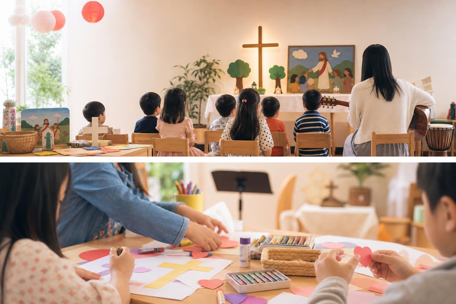
Kids & Youth
Simple pathways for children, youth, Sunday School, and fellowship groups.
Find your next step
Small groups, events, serving, and contact details feel easy to scan.
Ministries
Color depth should help the content feel organized.
These cards mimic ministry pages where we need a warmer hierarchy than red headings on white backgrounds.
- Children and youth ministry
- Sunday School and fellowship groups
- Serving opportunities and events